Closing enterprise deals with a journey redesigned all the way to the demo
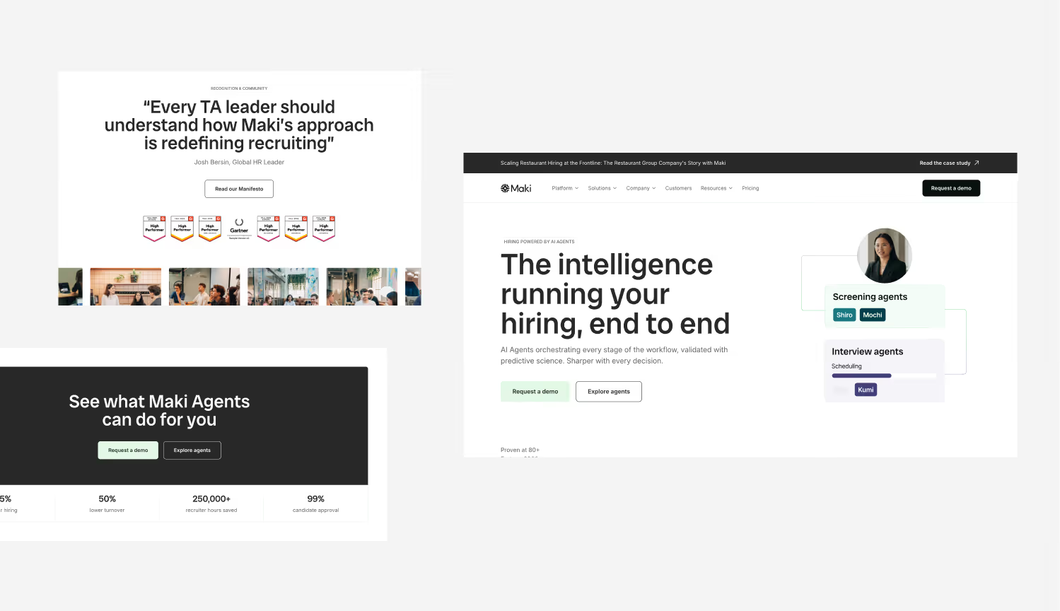
- 8 weeksof collaboration, from art direction to launch
- 8 sprintsto align the site with the prospects’ decision journey
- 2 × 90 minof training, then support after delivery
(Context) Maki
Maki builds AI agents that help companies with their recruiting. They were already signing companies like Capgemini and BNP Paribas.
After raising €26M, their positioning had evolved. The website, built in-house, no longer matched their new marketing and sales goals.
“We worked with Damien for 8 weeks on the redesign of Maki’s website, and the collaboration was outstanding on every level.”
 Juliette SantelmoFounder Associate @Maki
(01)Problem
The starting point
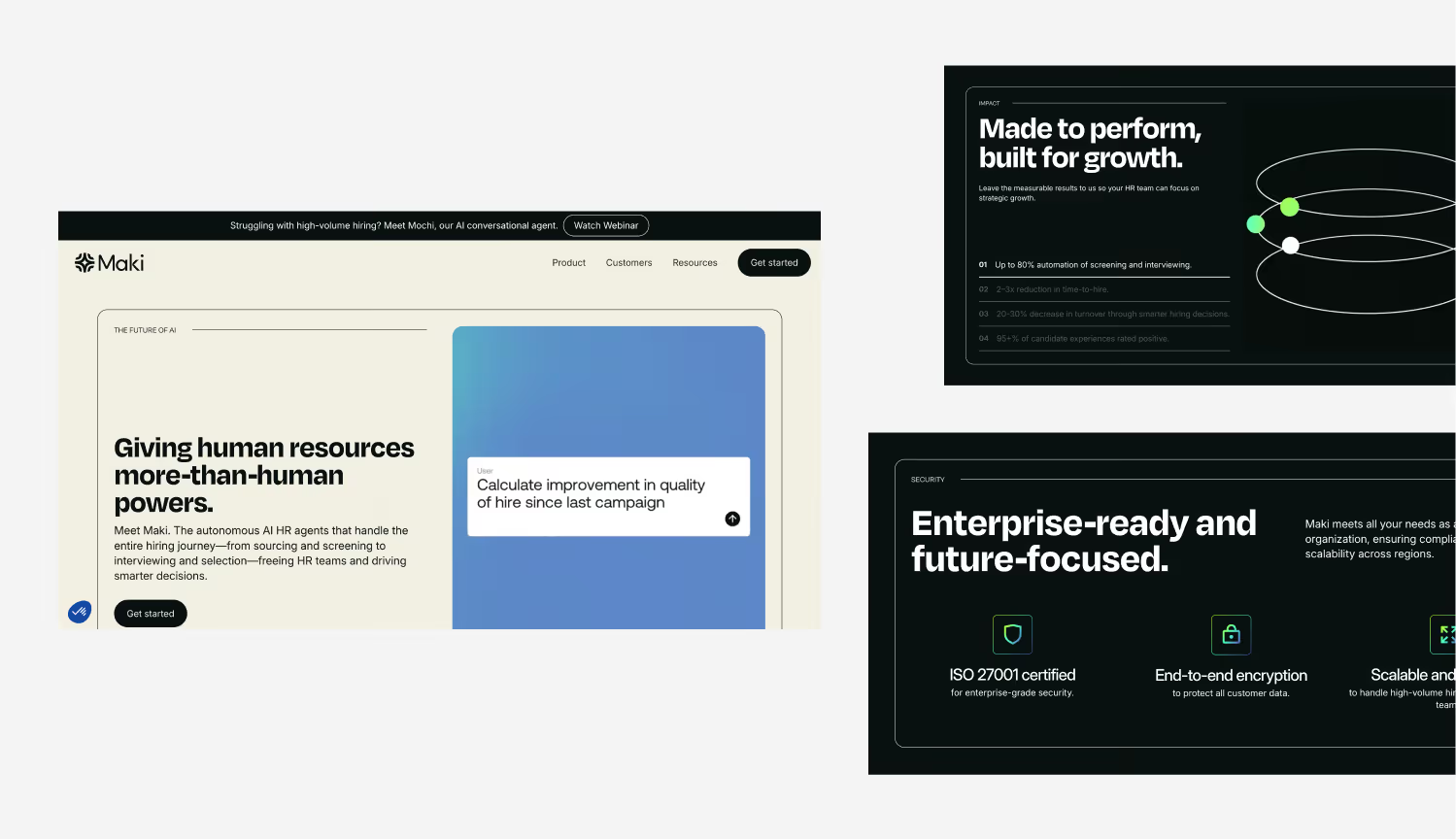
The website was out of step with the way enterprise accounts evaluate this kind of solution.
- 01
A very “dark / tech” visual direction that projected an early-stage image.
- 02
Few trust signals: security, detailed case studies, concrete proof.
- 03
Social proof that was there but underused.
- 04
A single CTA (“Get started”) offered very early, regardless of how informed the visitor was.
In practice, the site asked prospects to do part of the work themselves: figure out whether the product applied to their context, find the right proof, assess how reliable it was.
So they brought me in to propose a new visual identity, design their pages in Figma and build the new site in Webflow, to better structure the way their prospects discover and evaluate their solution.
(02)Method
What we put in place
The project was structured into 8 sprints. The goal wasn’t only to redo the design, but also to align the site with the steps their prospects go through before requesting a demo.
Step 1: Visual repositioning and design system
I started with the visual direction, moving away from the “technical product” aesthetic toward something more understated and readable. The idea wasn’t to “make it prettier” but to avoid creating needless doubt in the very first seconds.
Once the art direction was approved, I built a design system so the marketing/growth team could create new pages quickly, while keeping strong consistency as the site grew.
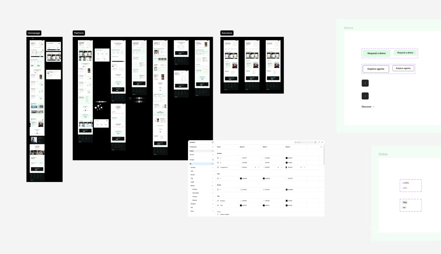
Figma design system “He structured the work into clear sprints: first precisely aligning the brand with our ICP, then creating a simple, scalable Figma design system.”
Juliette SantelmoFounder Associate @MakiStep 2: Structuring by context, rather than by product
The original site mostly presented the product. The problem is that an “enterprise” prospect has to make an effort to picture whether it applies to them. So we restructured the site to remove that effort.
I created pages by industry (retail, tech, services), each paired with case studies and specific proof points. I also added key pages such as security, integrations and resources, which directly answer the questions that keep coming up in a B2B sales cycle.
The goal was to reduce the time prospects need to understand whether the solution is relevant to them.
Step 3: Journey and engagement points
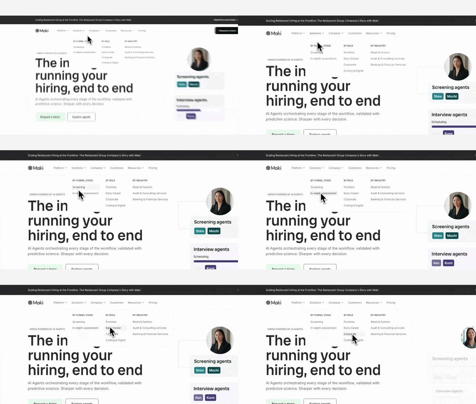
Part of the friction also came from the user journey. We replaced the main “Get started” CTA with “Request a demo” and introduced intermediate entry points: read a case study, explore the agents, see the integrations.
The goal was to offer different entry points, whether the prospect is discovering the product or already in the evaluation phase.
User journey Step 4: Build and autonomy
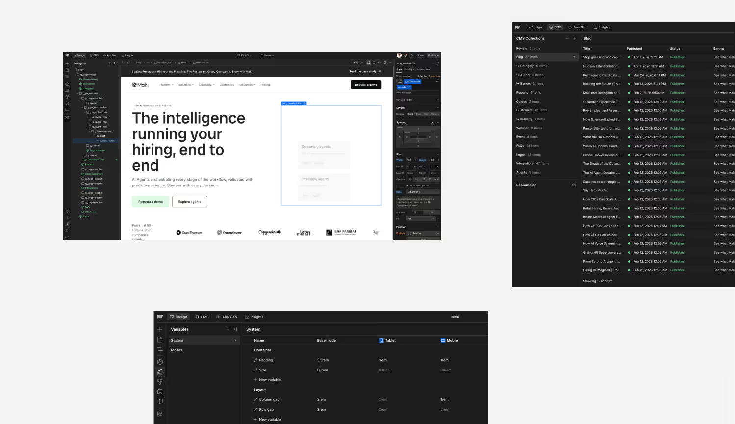
I built every page in Webflow with reuse in mind. I structured the CMS (case studies, integrations, FAQ, resources) so each type of content could be adapted easily, and designed modular components for creating new pages.
Finally, I trained the team in two 90-minute sessions and provided post-delivery support to make the transition smooth. The marketing and growth teams can now evolve the site without depending on anyone.
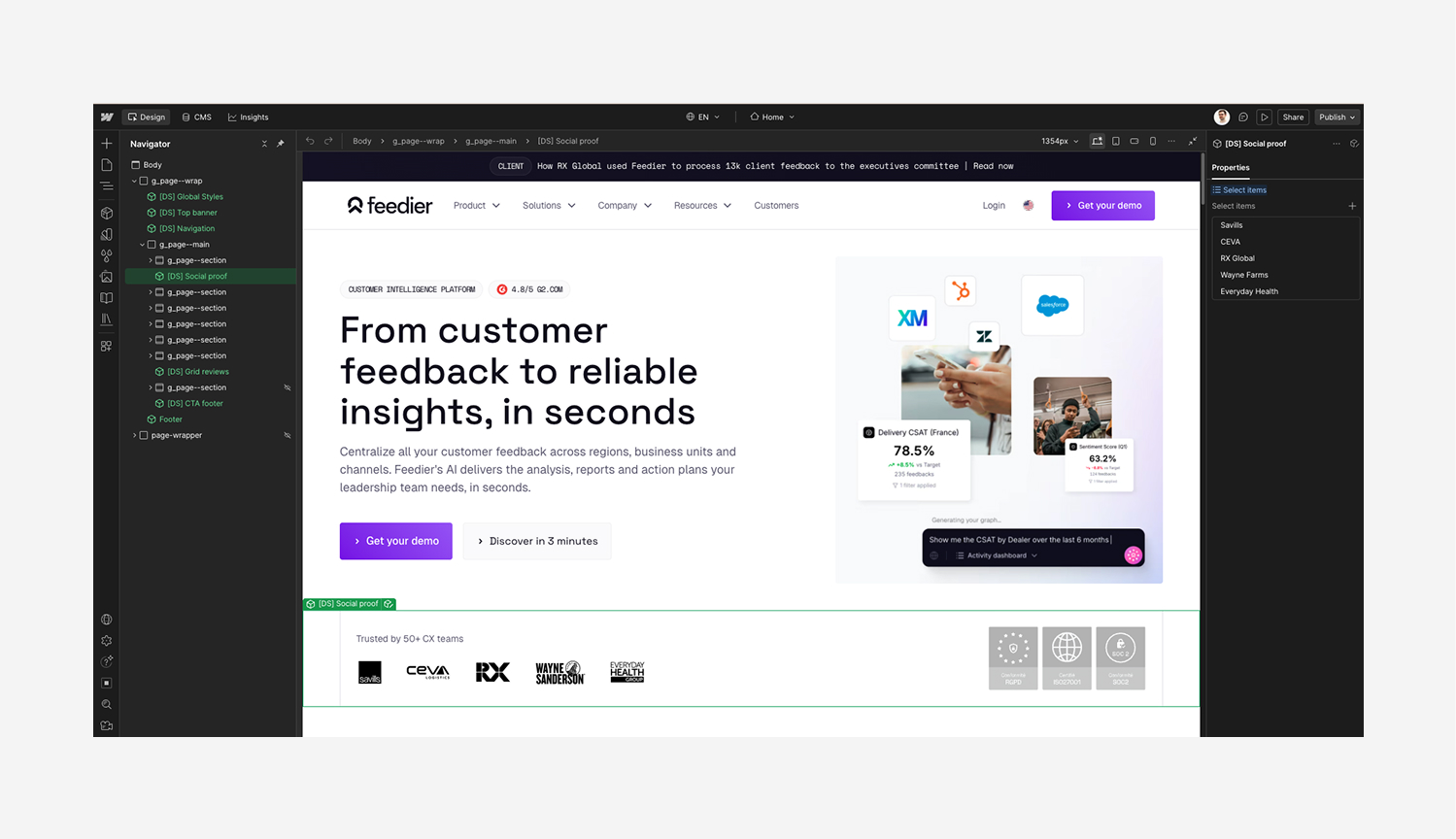
Webflow build “The QA and training made the transition smooth and free of any dependency.”
Juliette SantelmoFounder Associate @Maki
(03)Results
What it changed
- 01
A website that speaks to enterprise accounts from the very first seconds.
The visual identity and level of polish remove the dissonance between the maturity of the solution and the image prospects perceive.
- 02
An optimized user journey.
The structure by industry and use case lets visitors see in a few clicks whether the solution fits their context, without having to guess it themselves.
- 03
A website that lays the groundwork before the sales call.
The security, integrations and case study pages answer the recurring objections of the B2B sales cycle before prospects even get in touch.
- 04
Engagement points matched to the visitor’s level of maturity.
The journey offers intermediate entry points (case studies, agents, integrations) instead of pushing a single CTA too early.
- 05
A marketing team that runs the site on its own.
The design system, structured CMS and modular components make it possible to create and publish new pages with no technical dependency.
In 8 weeks, we built a system the marketing, growth and sales teams can use every day. Both to present the product and to structure their conversations with prospects.
“We’re leaving with a solid, durable technical foundation that fits our growth. Damien isn’t just an excellent developer, he’s a reliable, flexible and committed partner I recommend without hesitation.”
Juliette SantelmoFounder Associate @Maki